
NBC
NBC
A rebranding of NBC for the new era of television.
BRIEF
In 2015, I was given a rebranding assignment at Art Center. I was instructed to hypothesize a scenario in which NBC required a rebranding because of low ratings and the move to streaming video.
SOLUTION
I came up with a vision for a new brand identity for the network. The specifications of the new brand identity system is documented in a revised design guide for NBC employees, excerpts from which can be seen below.
project objectives
Brand Identity Design
Interface Design
A New Identity
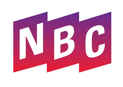
Redesigned Logo
Because NBC is trailing in fourth place in the ratings, it is time for a new company and a new identity. NBC is often referred to as the “Peacock Network” because of its peacock logo, created originally to emphasize its color broadcasts. It has become one of the most recognized logos around, but I updated the logo because it does not accurately represent the NBC of today. The pictorial representation of the peacock has been removed. However, because the colorful peacock logo has carried a lot of brand equity in the last fifty-plus years, the redesigned logo continues to evoke the color spectrum.
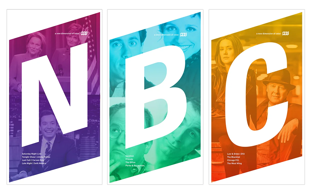
POSTER SERIES
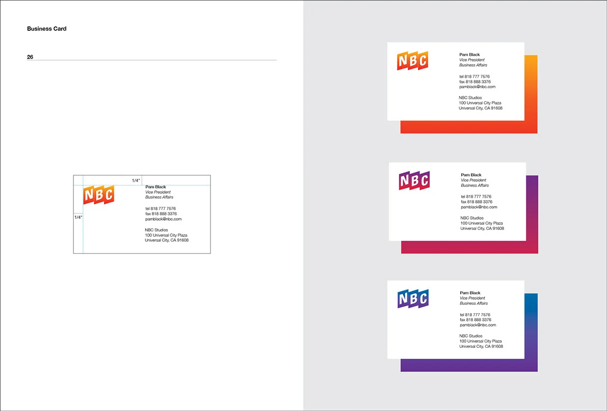
Business Card
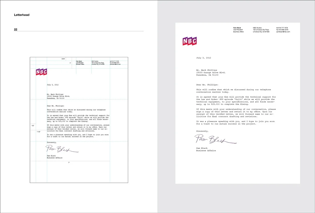
Letterhead
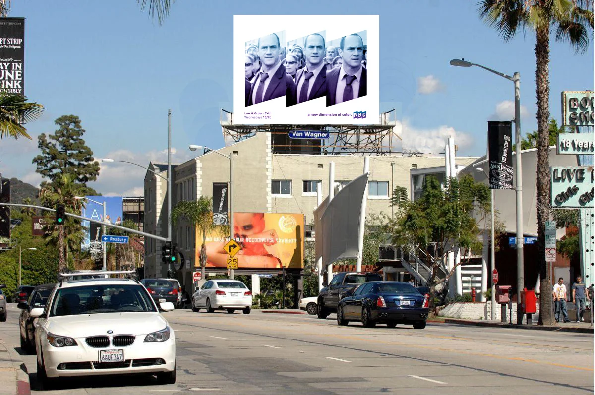
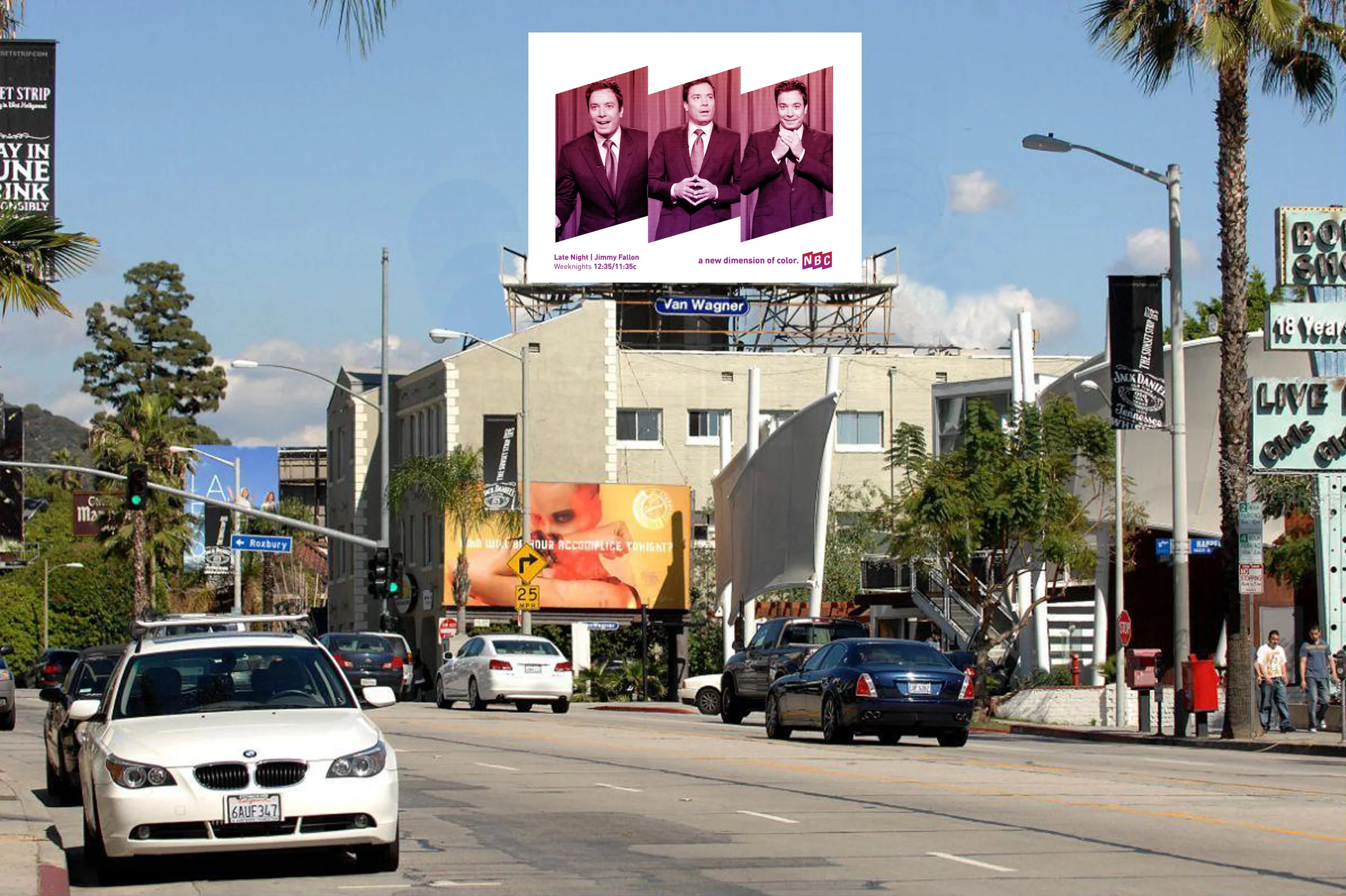
BILLBOARD SIGNAGE
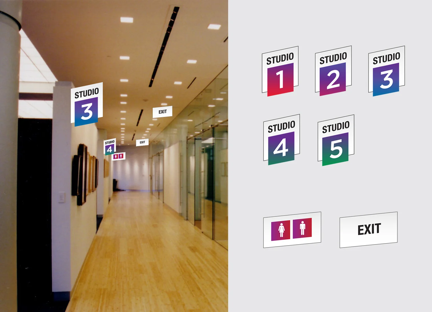
INTERIOR SIGNAGE
Animated logo with nbc chimes
(Click to play video)

websitE
(Click to play video)
